

Loading…
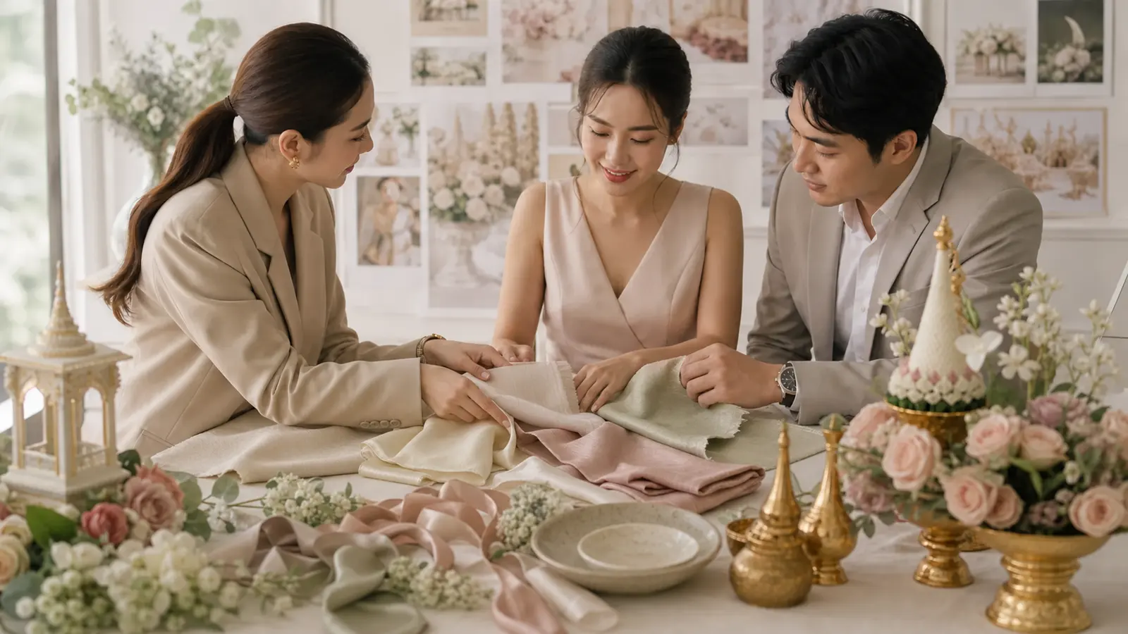
Notice how the weddings that look "expensive" all have one thing in common? Everything sits in the same colour tones. That's the power of a colour theme — the thread that ties everything together, from invitations, flowers and backdrop to outfits and the guest dress code. Here's how to choose a theme and the popular palettes to start from.
Simple rule: pick 1–2 main colours plus 1–2 neutrals or accents — about 3–4 in one palette. The trick is a neutral (cream, white, greenery) to rest the eye and make the event look calmer and far more expensive.
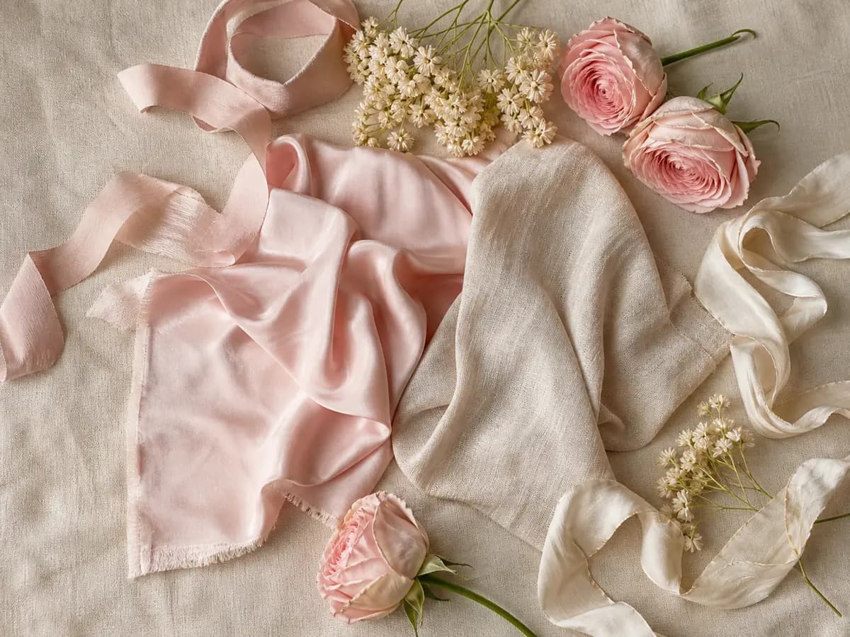
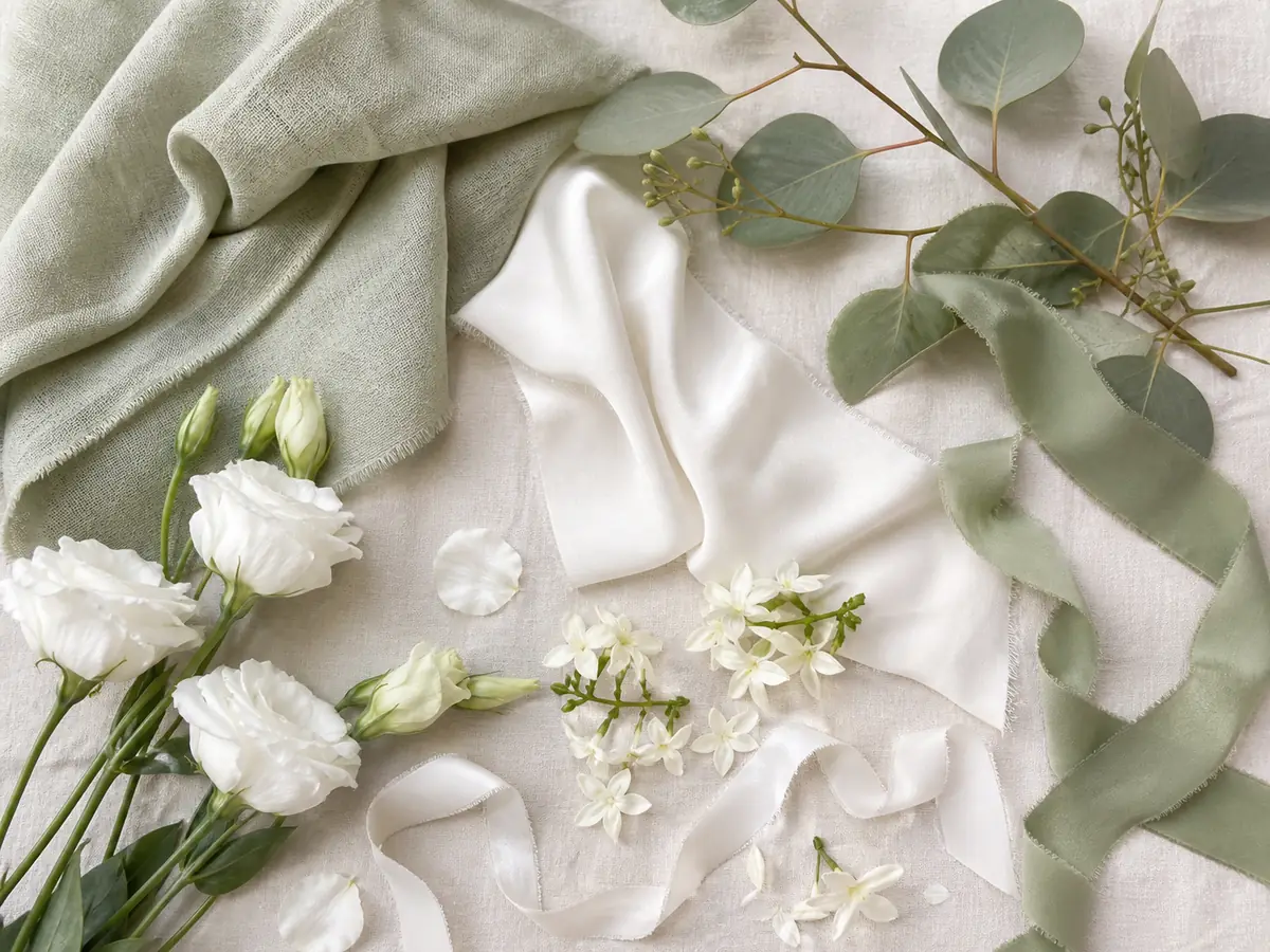
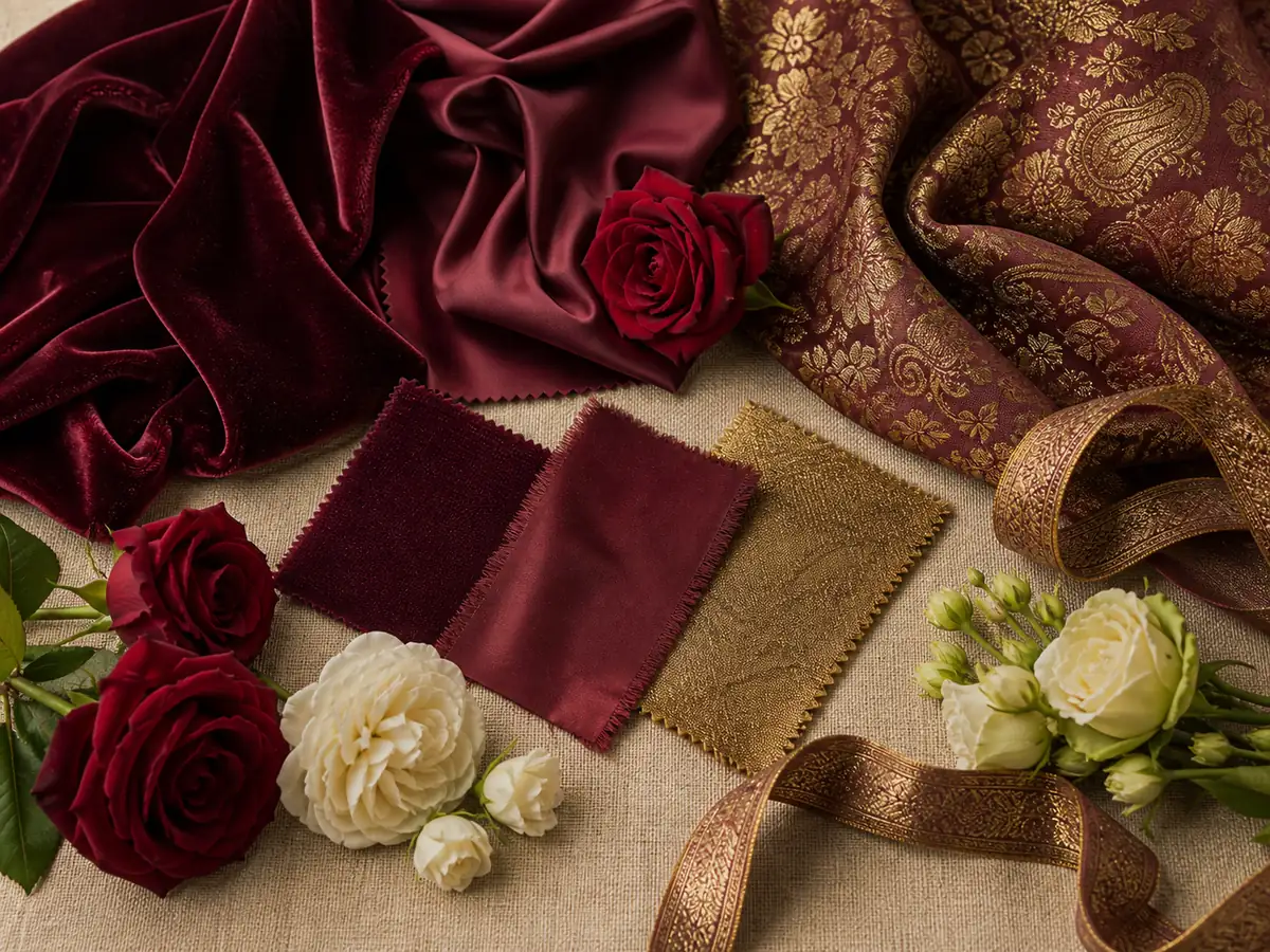
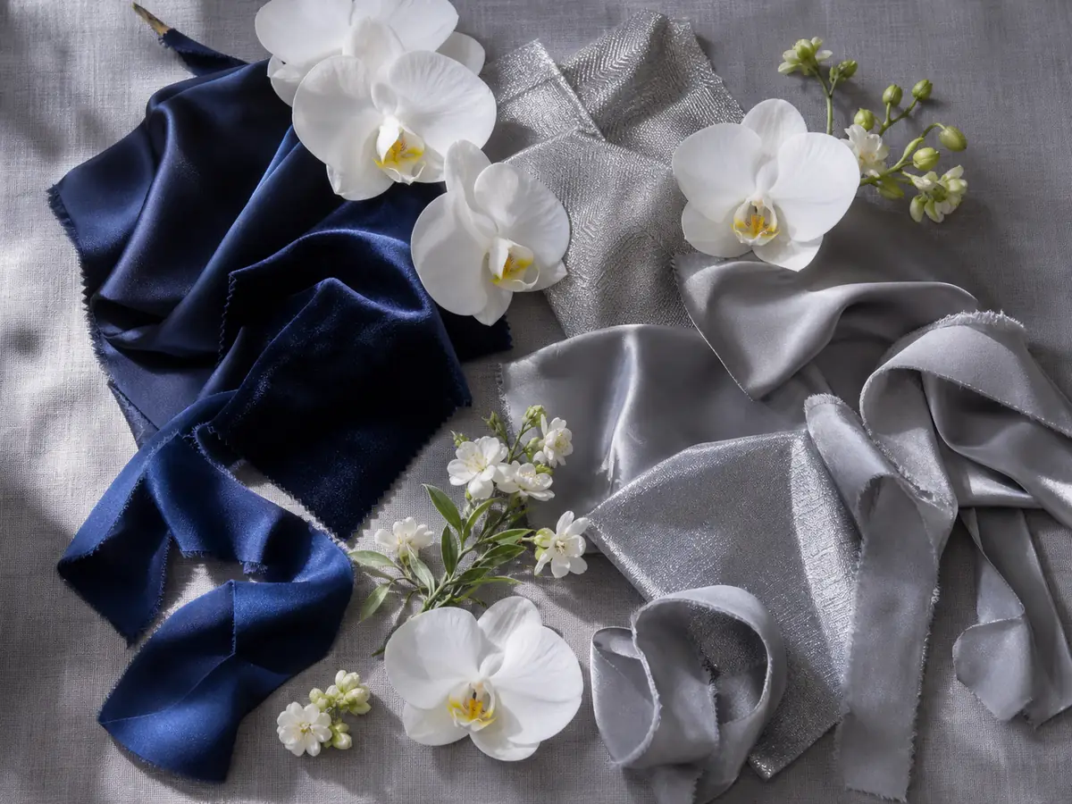
| Palette | Tone | Mood |
|---|---|---|
| Blush + champagne gold | Blush / gold | Sweet, luxe, gentle |
| Sage + ivory | Sage / ivory | Natural, easy on the eye |
| Dusty blue + grey | Dusty blue / grey | Calm, refined |
| Burgundy + gold | Burgundy / gold | Warm, deep, year-end |
| Red + gold | Red / gold | Thai-Chinese auspicious |
| White + greenery | White / greenery | Minimal, fresh |
Once you've chosen a palette, carry the same colours through every touchpoint for cohesion:
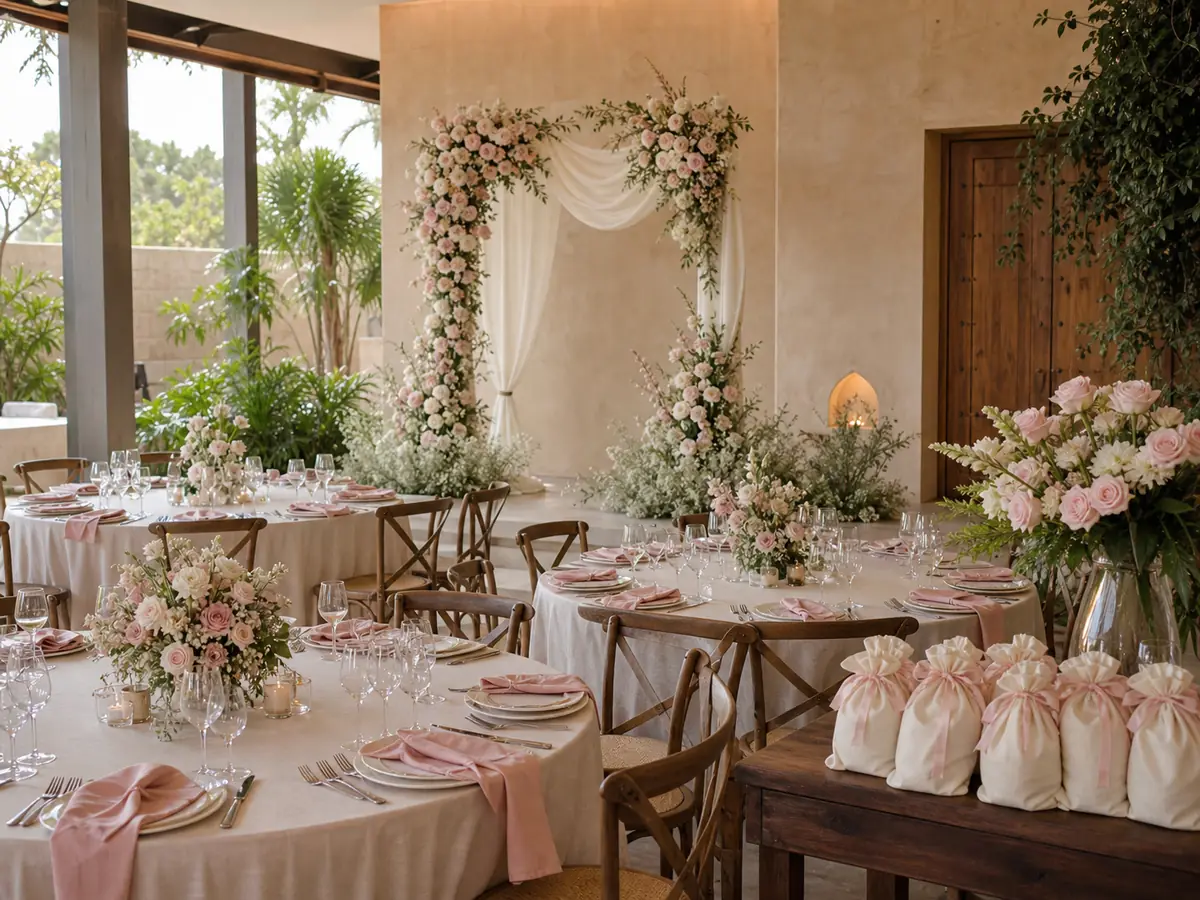
Colour affects the budget indirectly — some flower or décor shades that need special ordering cost more than easy-to-find ones. The trick: a palette that uses seasonal flowers and items helps control the décor budget (see Wedding Budget Breakdown).
A colour theme touches many categories — invitations, flowers, outfits, favours. Wedly lets you note the theme/palette in your checklist and tie each cost to your budget, so you see how much themed décor takes and can rein it in before ordering — so the theme stays beautiful without blowing the budget.
Choose a theme from venue + season + colours that flatter the couple, build a ~3–4 colour palette with a neutral to rest the eye, then carry the same colours from invitations and flowers to the backdrop and dress code. That's how an event reads as one cohesive story — and pick shades you can source seasonally to control the budget.
Commonly 1 to 2 main colours plus 1 to 2 accent or neutral colours — about 3 to 4 in one palette. More looks busy. A neutral like cream, white or greenery keeps the palette calm and more expensive-looking.
Mainly the venue and season — tones that suit the room or garden photograph well and don't clash. Some couples pick a favourite colour or an auspicious one per family belief. Also choose colours that flatter the couple's skin tones and outfits.
Not mandatory, but it makes the overall look and group photos far more cohesive. If you set one, choose a broad tone that's easy to find, not so specific it's hard to buy, and note it on the invitation in advance.
Indirectly. Some flower or décor shades that need special ordering cost more than easy-to-find colours. Choosing a palette that uses seasonal flowers and items helps control the décor budget.
Ready to start planning your wedding?